GUIDE CC
Guide is a cycling apparel brand built on community, taking its name from Rule Number 3 of the Rules of Cycling: guide the un-initiated.
The brand came to me wanting a full brand kit and a fresh visual identity that would speak to style-conscious male cyclists aged 20 to 40, riders who care about performance and aesthetics equally. I shaped the new brand direction from the ground up, designing the updated logo and brand elements and a full apparel range of caps, hoodies, t-shirts and socks. The result is a clean, minimal and modern brand with subtle nods to cycling culture, wearable on and off the bike, that helps riders recognise each other as part of one team.
Brand Identity Design
Client: Guide CC
Location: United Kingdom
Industry: Independent Clothing Brand
Branding; Bethany Mulchinock

BRAND STRATEGY
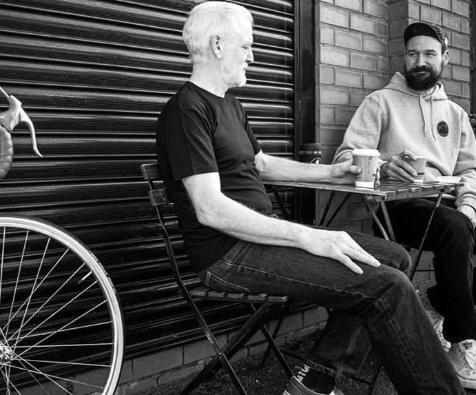
Guide is a cycling apparel brand built on community, and its strategy starts with a single idea: guide the un-initiated. The audience is style-conscious male cyclists aged 20 to 40 who value performance and aesthetics in equal measure, so the brand sits in the space between technical cycling kit and always on fashion, offering clothing that is wearable on and off the bike. Its personality is welcoming, confident and understated, like an experienced rider showing someone the ropes. The long-term aim is recognition and belonging: when riders see each other in Guide, they know they're part of the same team, helping to build a positive cycling community and a more sustainable way of life.
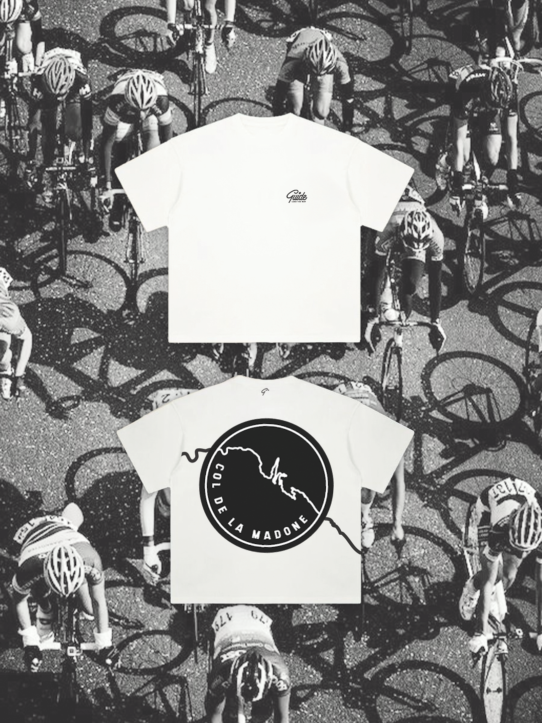
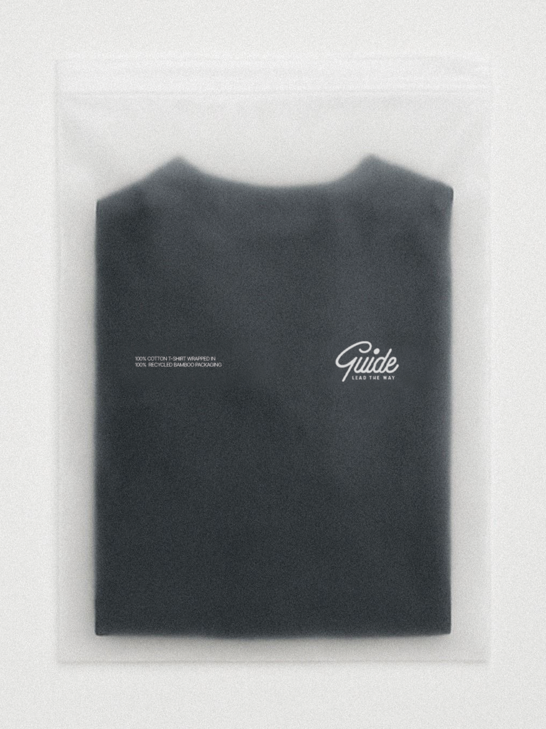
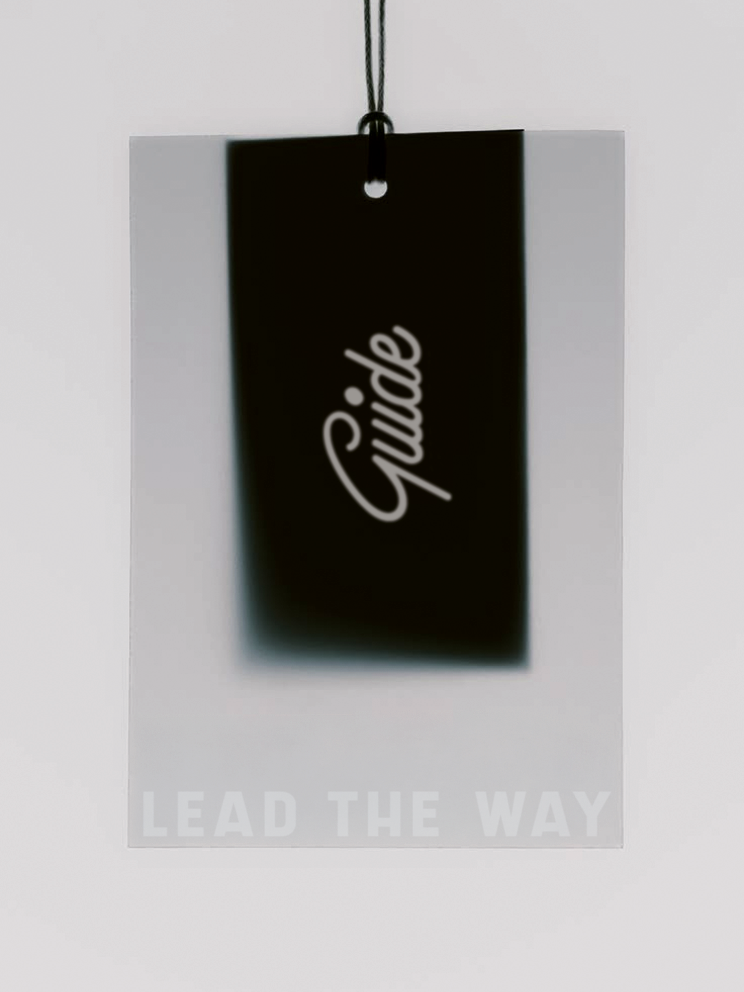
BRAND IDENTITY
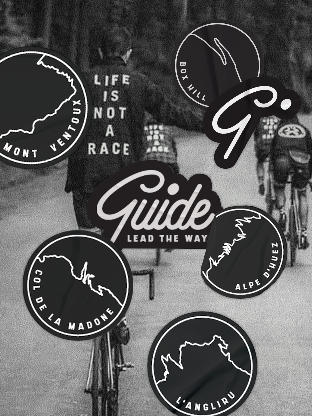
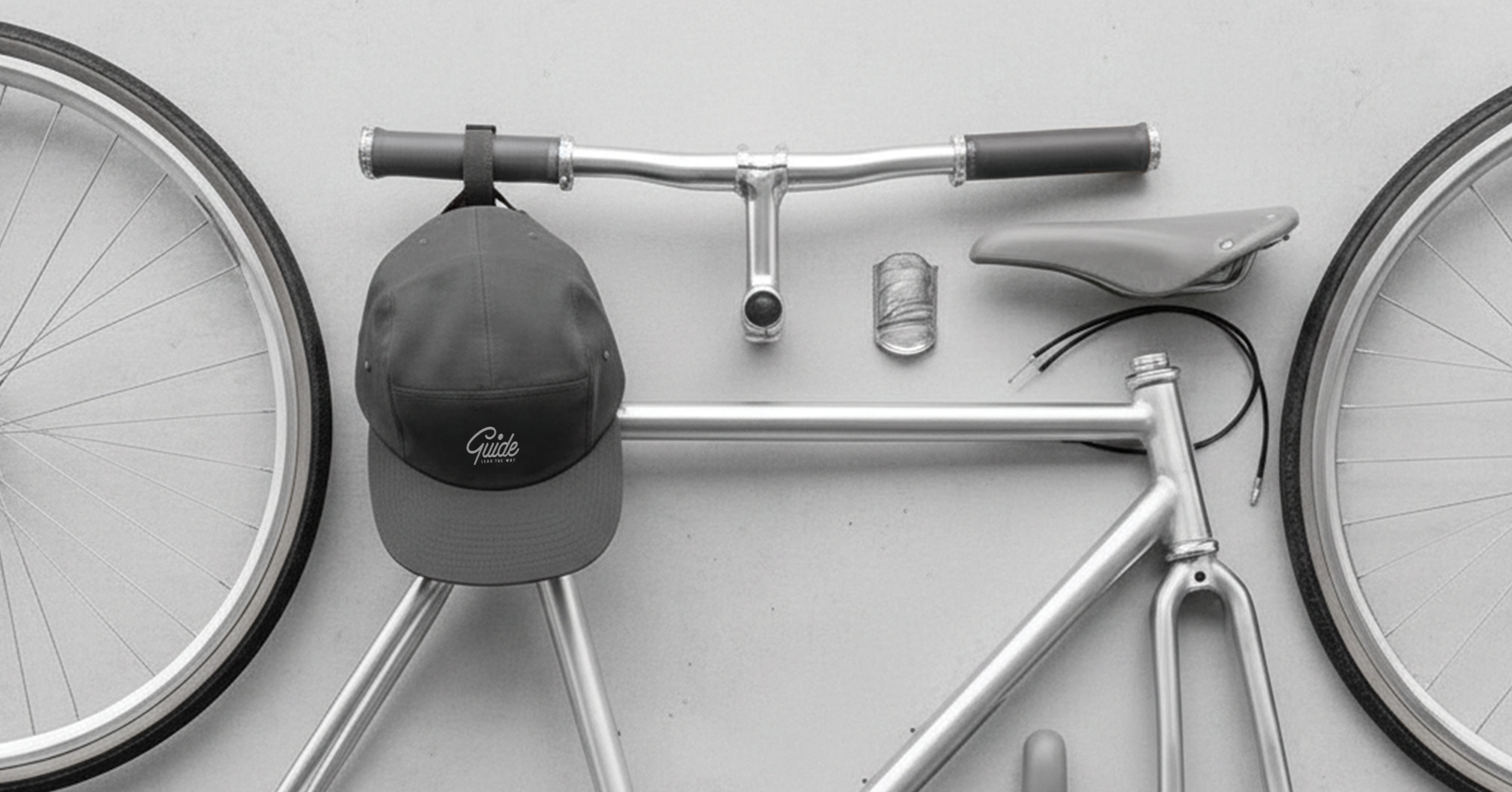
Guide's visual identity comes to life across a cohesive brand system: a route-inspired t-shirt series with cycling-badge graphics, sustainable bamboo paper packaging with clean product details, and custom stickers and labels that make every unboxing feel special. Refined typography, a considered colour palette and understated graphics run through every touchpoint, so the brand is recognised on the road and loved off it.
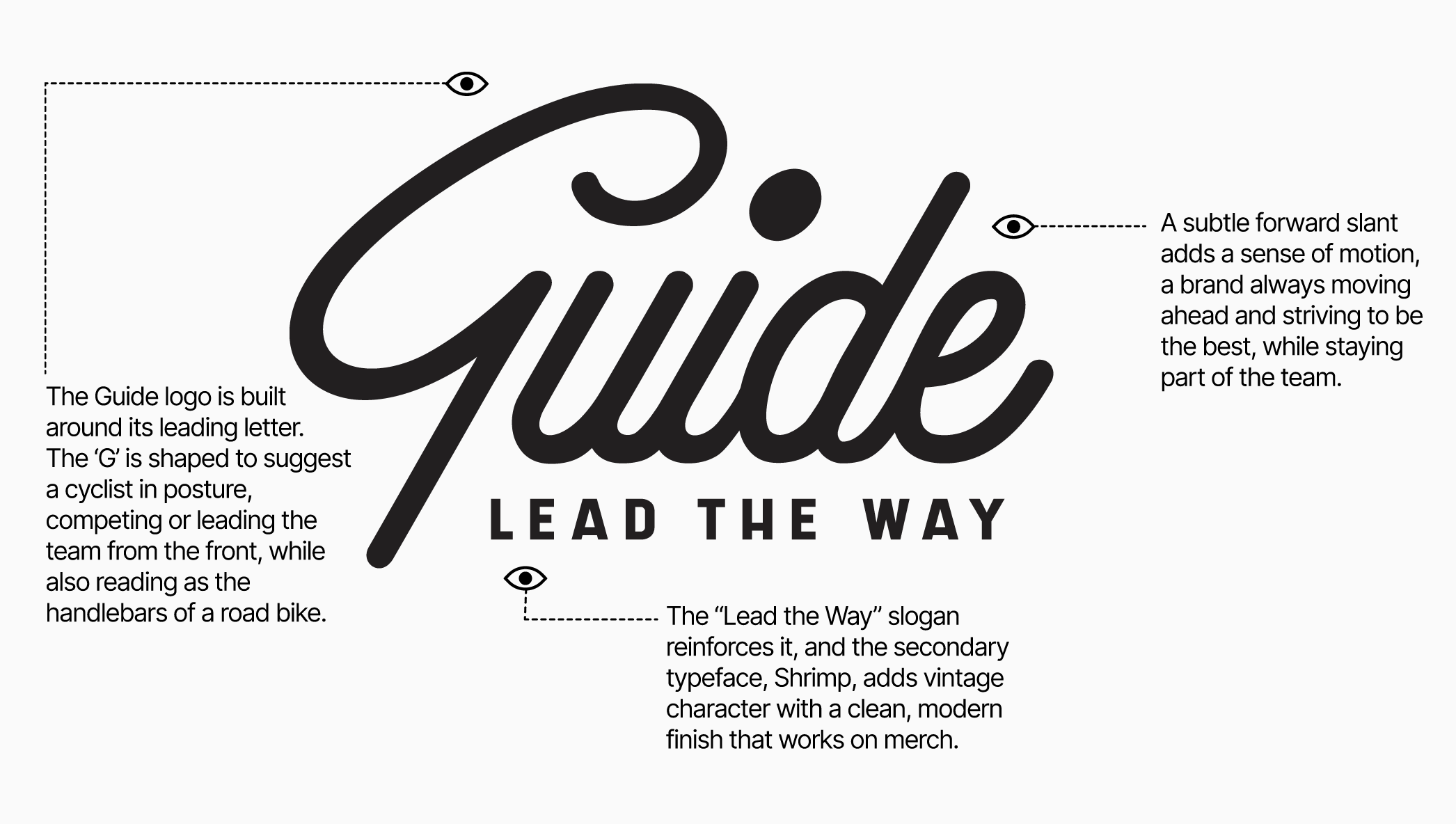
LOGO BREAKDOWN
The Guide logo is built around its leading letter. The G is shaped to suggest a cyclist in posture, competing or leading the team from the front, while also reading as the handlebars of a road bike. A subtle forward slant adds a sense of motion, a brand always moving ahead and striving to be the best while staying part of the team. The “Lead the Way” slogan sits with the mark to reinforce that idea, echoing the G as the one setting the pace. To support the logo, the secondary typeface is Shrimp, chosen to give the founder the vintage-style character he wanted with a modern, clean finish, so it translates well across merchandise.
BRAND IN MOTION
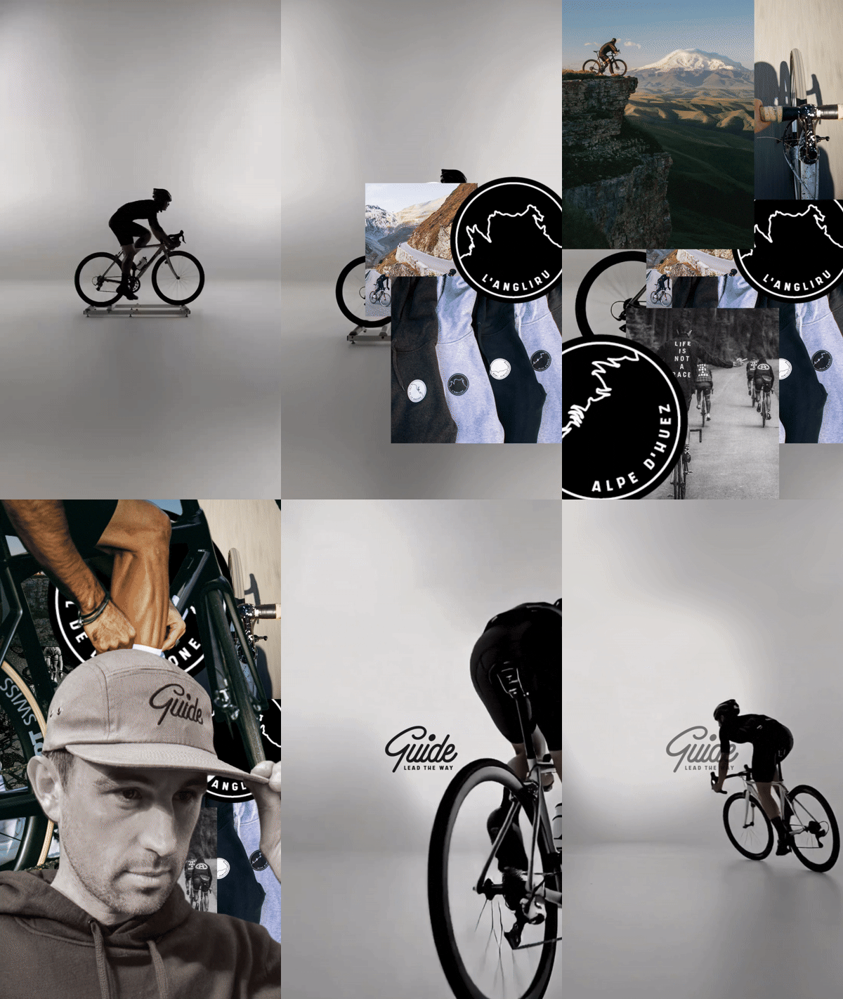
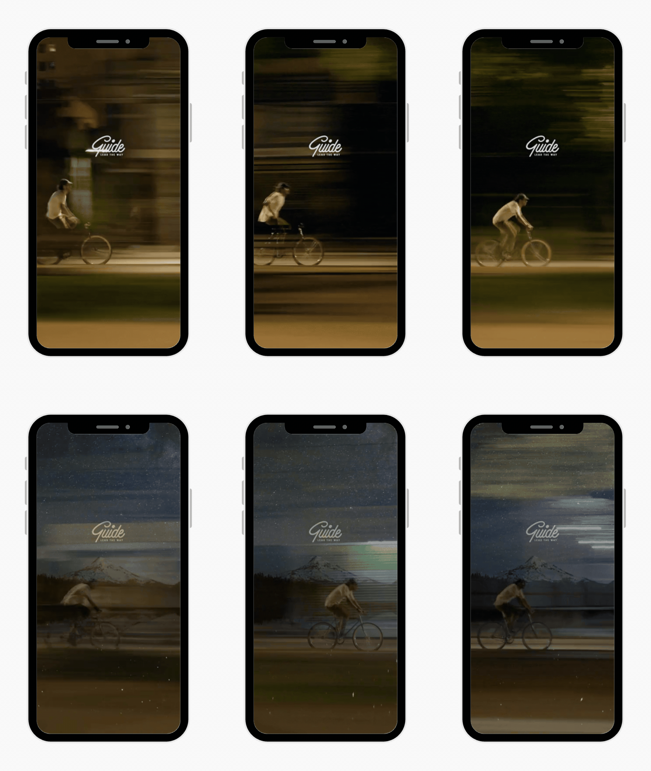
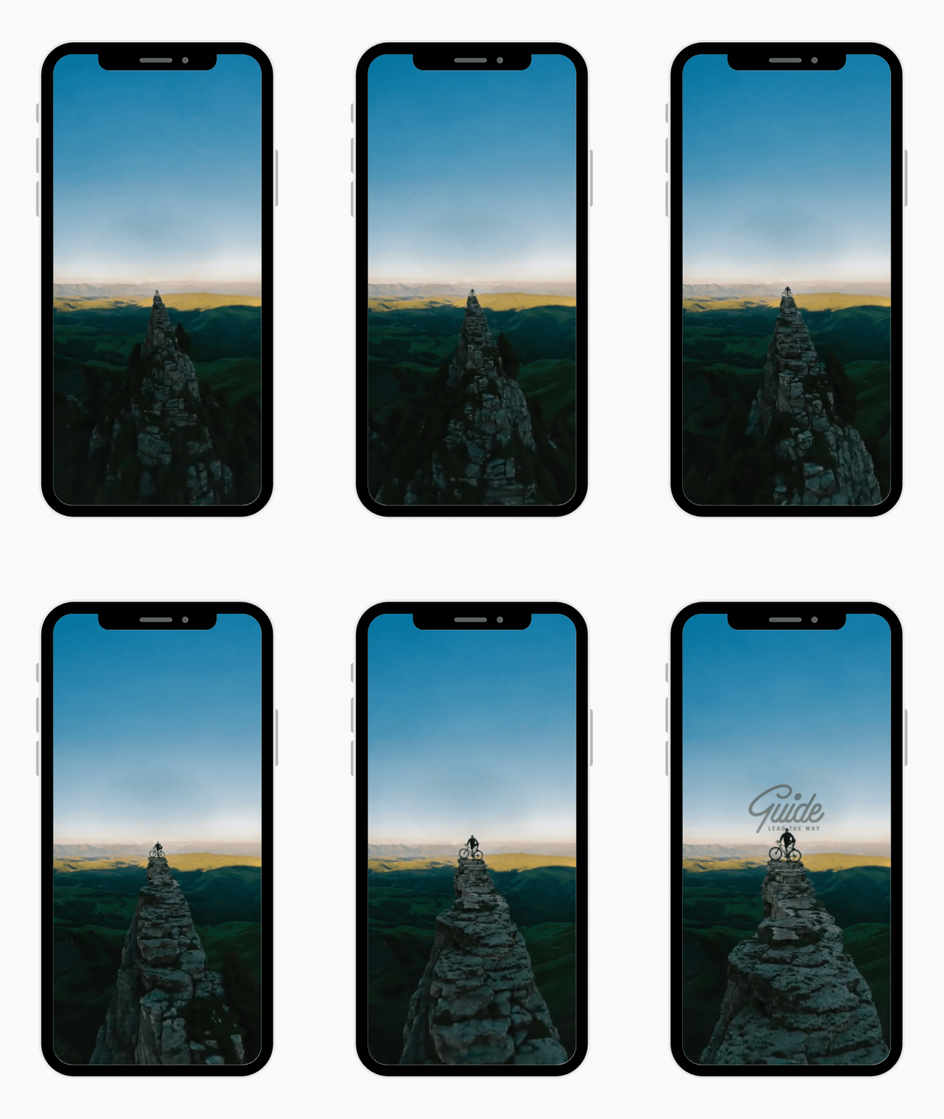
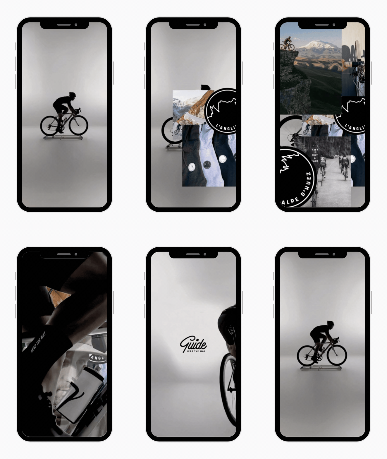
A logo-led teaser campaign built to create anticipation ahead of Guide's new collection launch. Short-form motion content puts brand and feeling first, with no product and no hard sell, drawing audiences into the Guide world before leading them to a waitlist landing page. The campaign blurs cycling, activewear and everyday fashion, creating something that feels less like an ad and more like a movement.