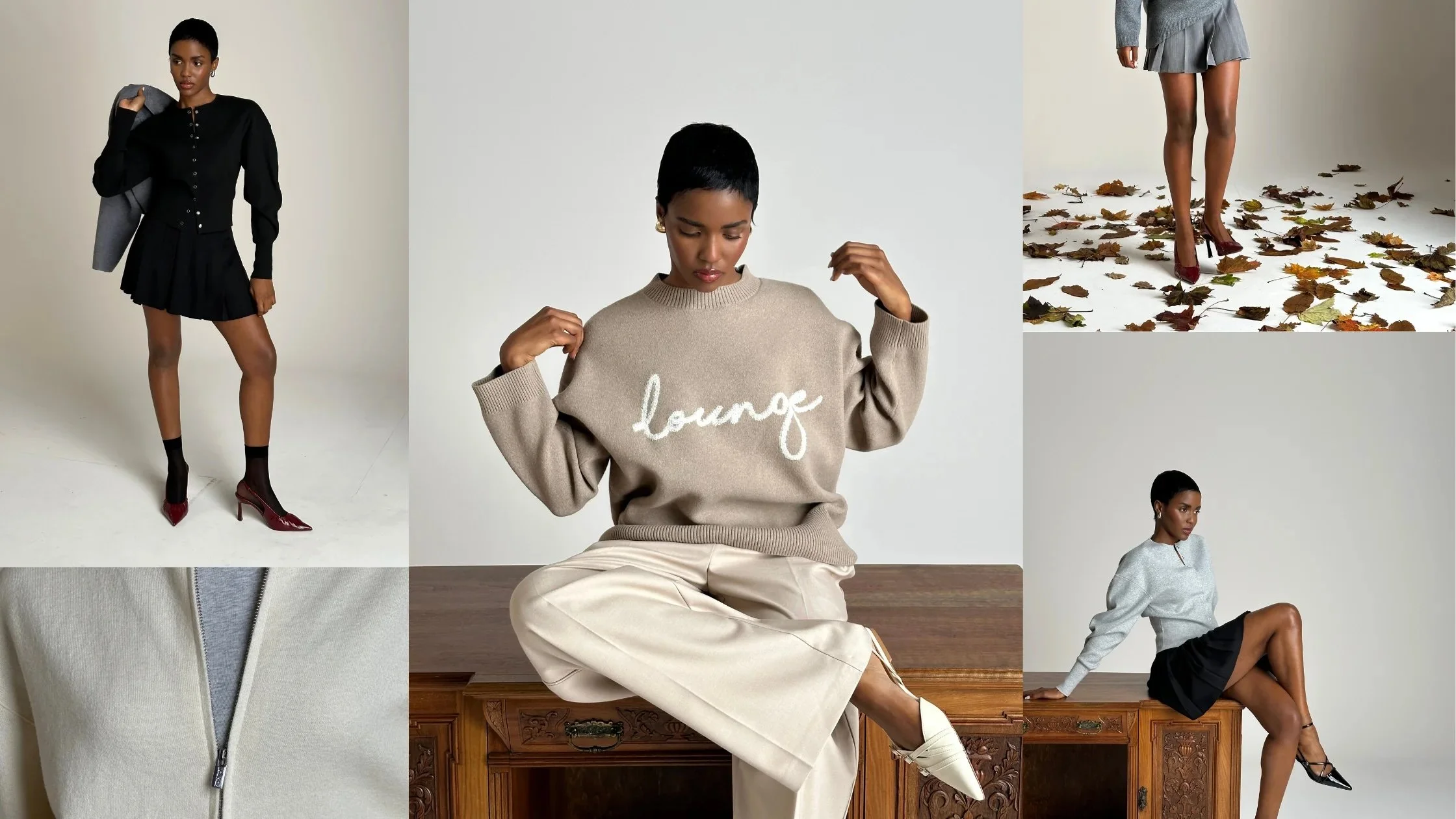
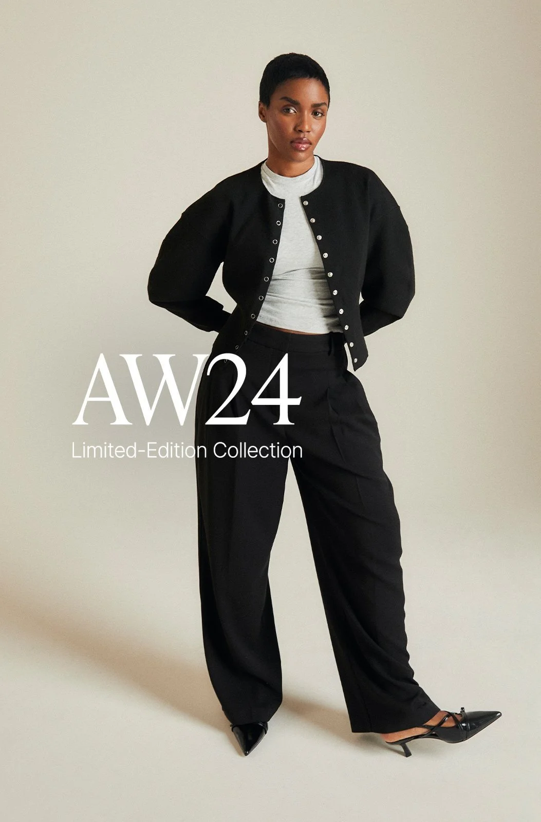
AW24
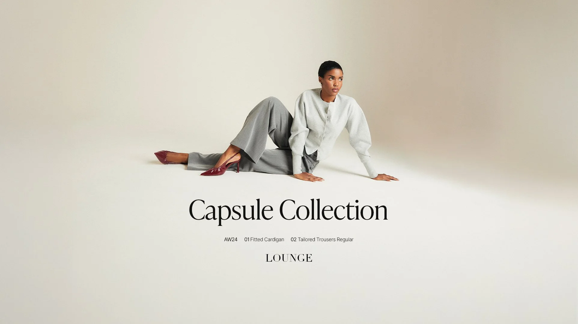
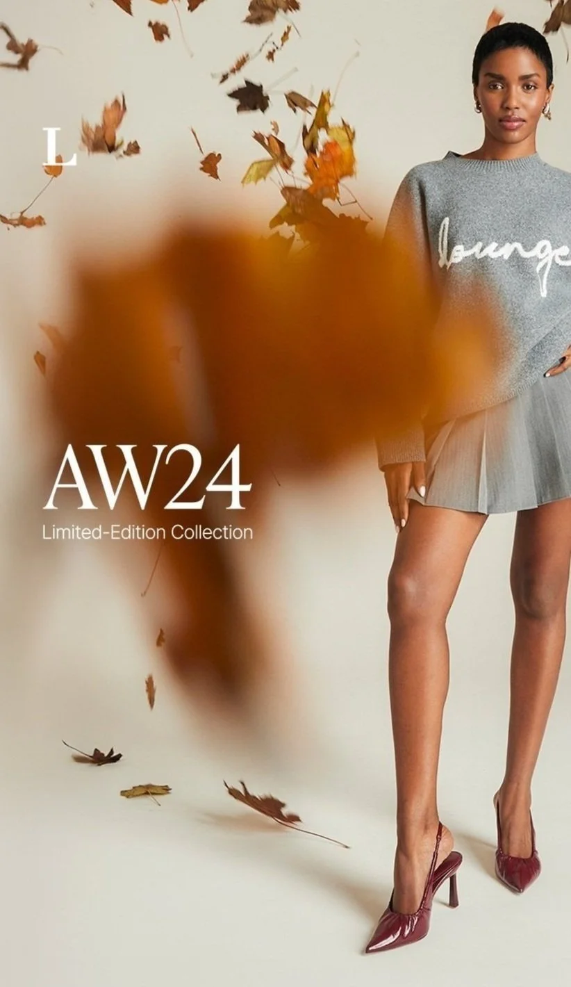
For the branding, I leaned into our core visual identity by using our primary typeface, Didot—reinforcing brand recognition and creating a seamless bridge between our existing audience and this new direction. The collection embraces a high-end, minimalist aesthetic, deliberately avoiding bold graphics to let the garments speak through form, fabric, and silhouette.
The few graphic elements included were purposefully subtle and editorial in nature. Inspired by traditional fashion lookbooks, they guide rather than distract—minimal yet intentional. The AW24 label quietly grounds the collection in an autumnal mood, evoking the season’s tone and texture while keeping the focus firmly on the clothing.
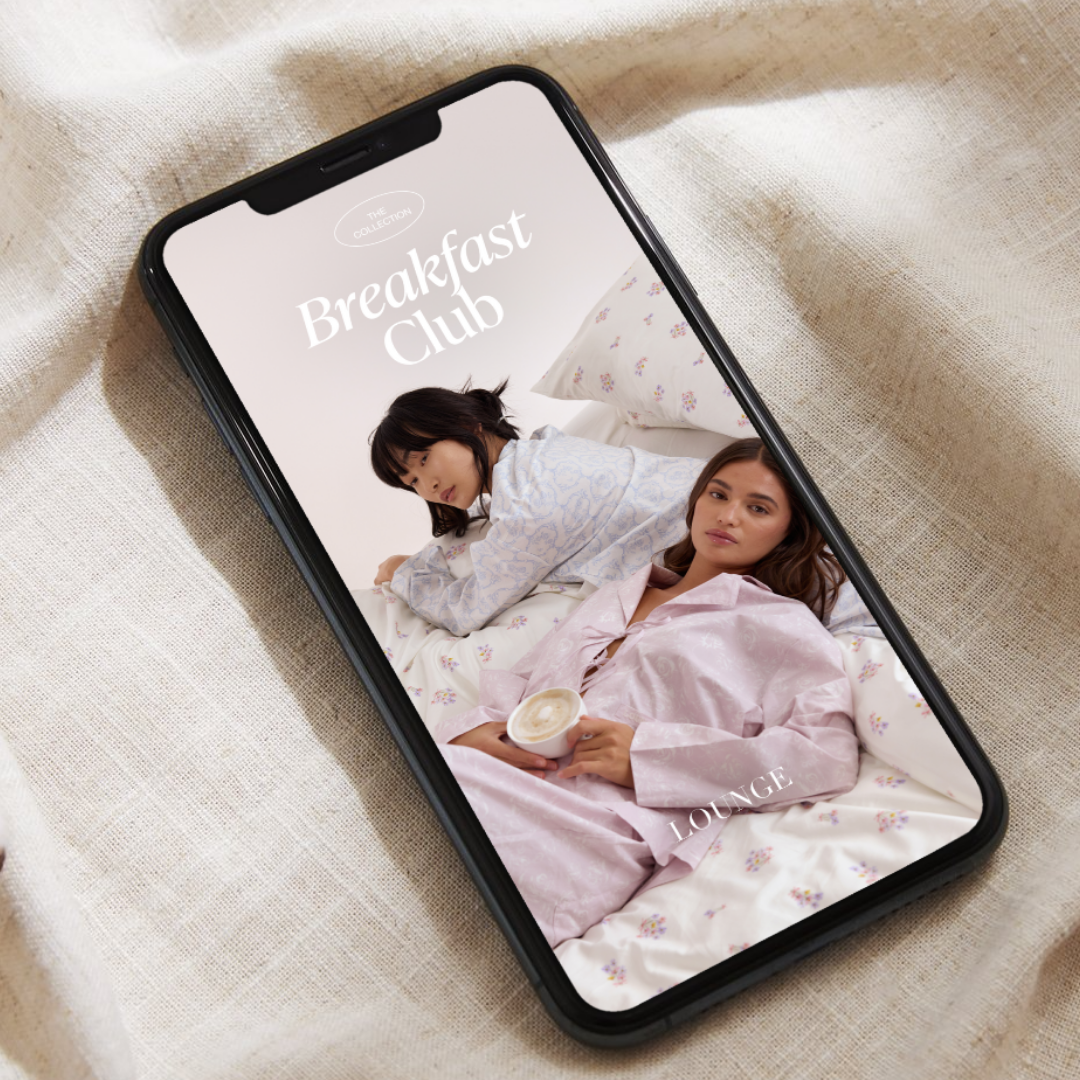
OCT 24 In House, HQME Studio
Branding; Bethany Mulchinock
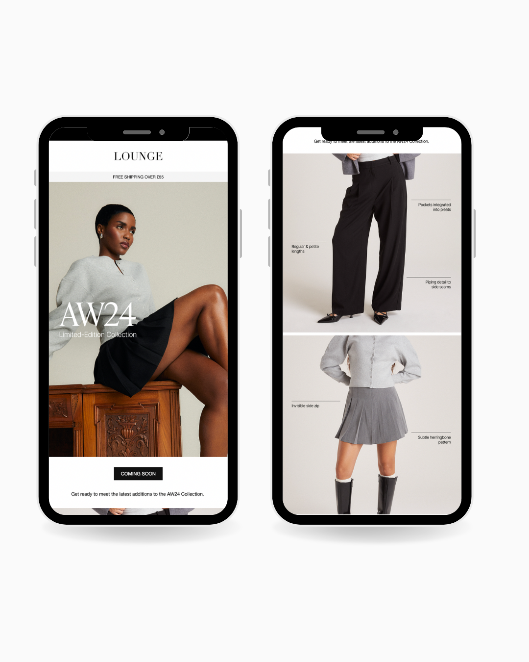
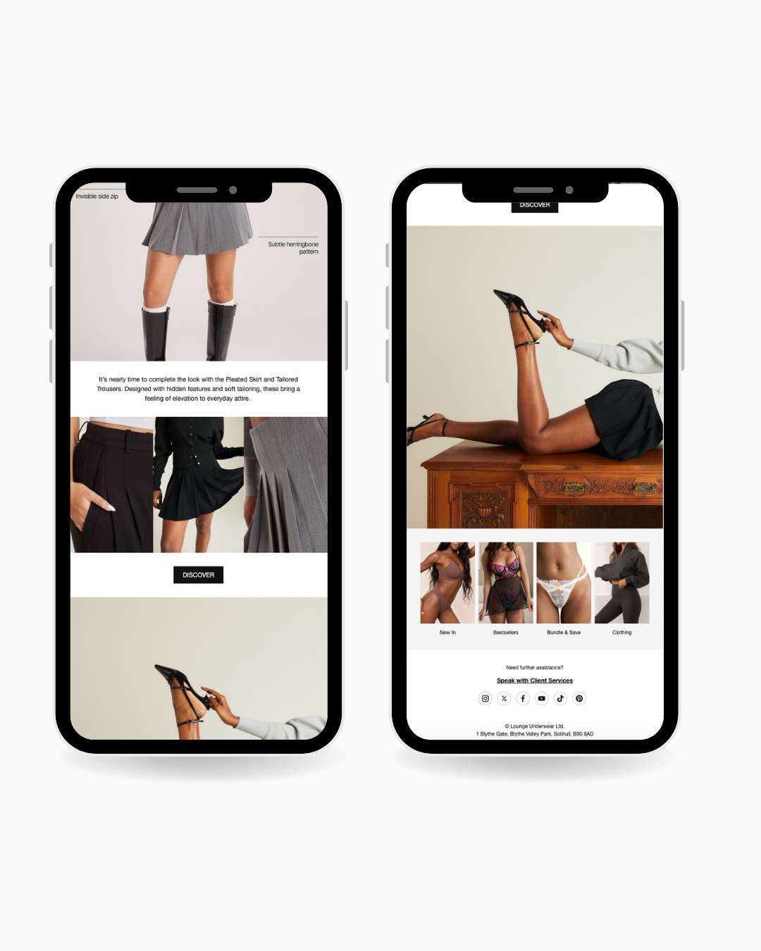
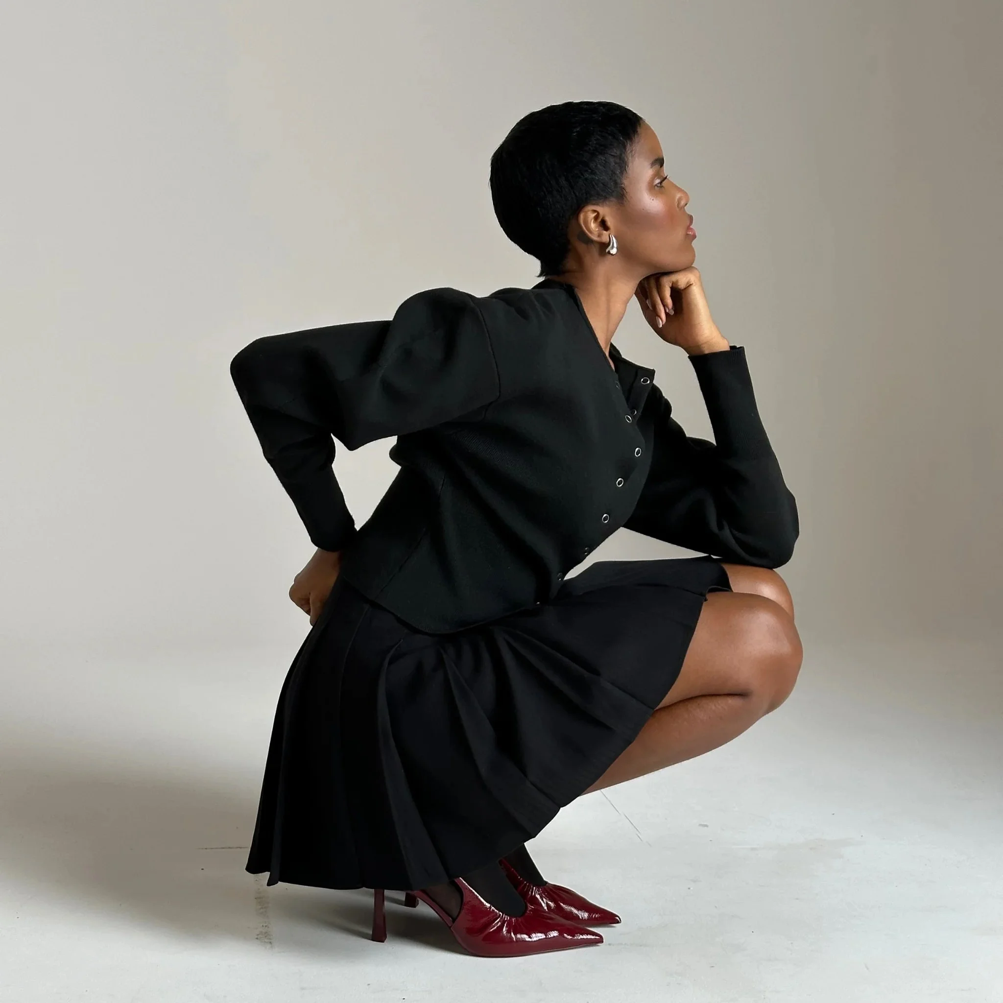
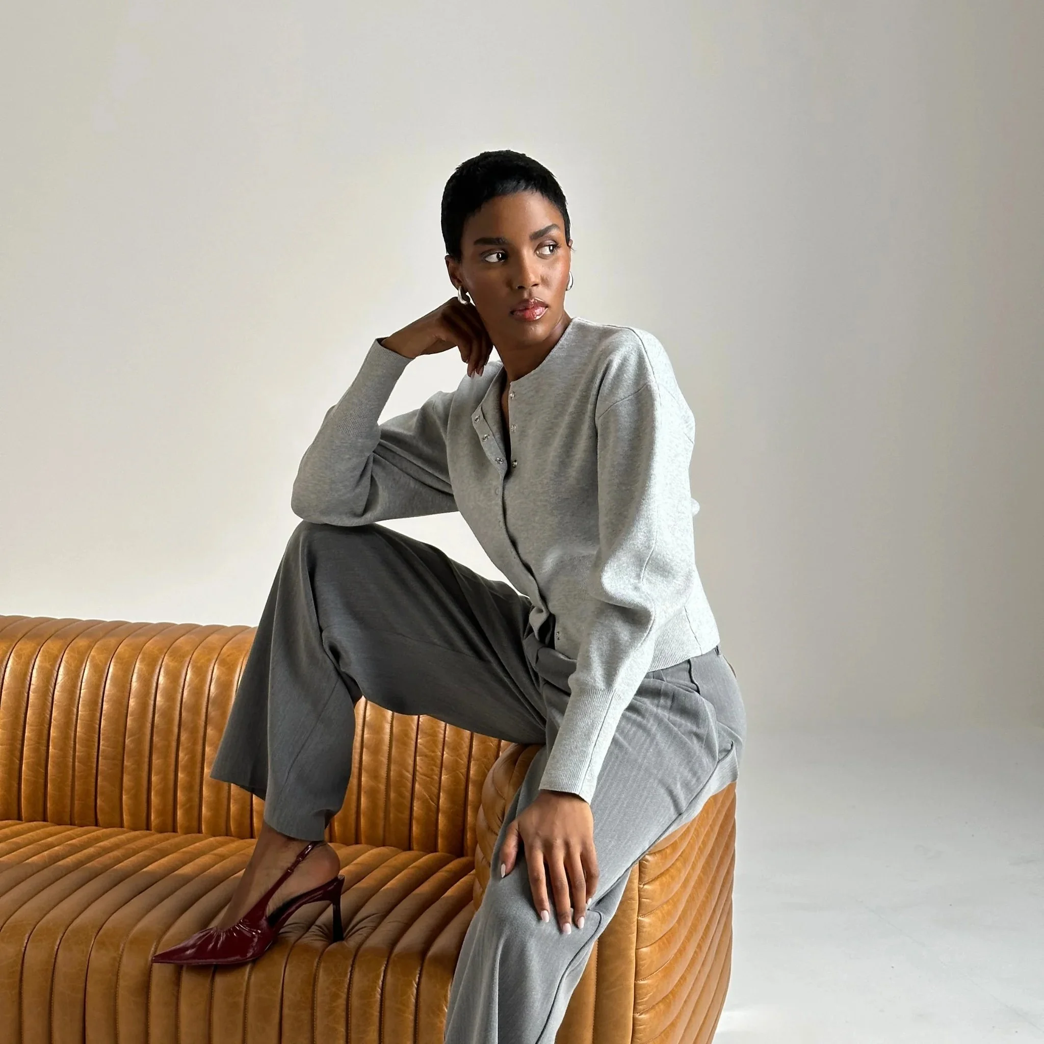
For our social platforms, we crafted a high-fashion yet approachable content strategy designed to drive engagement, build brand awareness, and increase conversions. By blending behind-the-scenes “sneak peek” clips, “how to layer” styling videos, and curated close-up detail shots, we aimed to create visually compelling, shareable content that not only captures attention but also encourages users to explore the full collection.
This strategic mix of aspirational and educational content was designed to spark curiosity, build anticipation, and drive traffic from discovery to purchase—ensuring our audience stays engaged and inspired to shop the look.