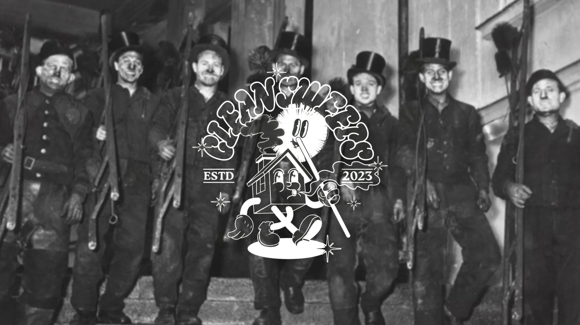
This project involved the conceptualisation and design of a full brand identity for a traditional chimney sweeping business. The goal was to preserve the craft’s rich heritage while creating a modern, fun and memorable brand that resonates with both older generations who value tradition and younger homeowners who seek stylish, contemporary design.
The creative direction centred around reviving historical chimney sweeping imagery and reinterpreting it through playful illustration, retro typography, and a bold colour palette. By blending nostalgia and modernity, the brand establishes a unique identity that celebrates its roots while appealing to a wider, modern audience
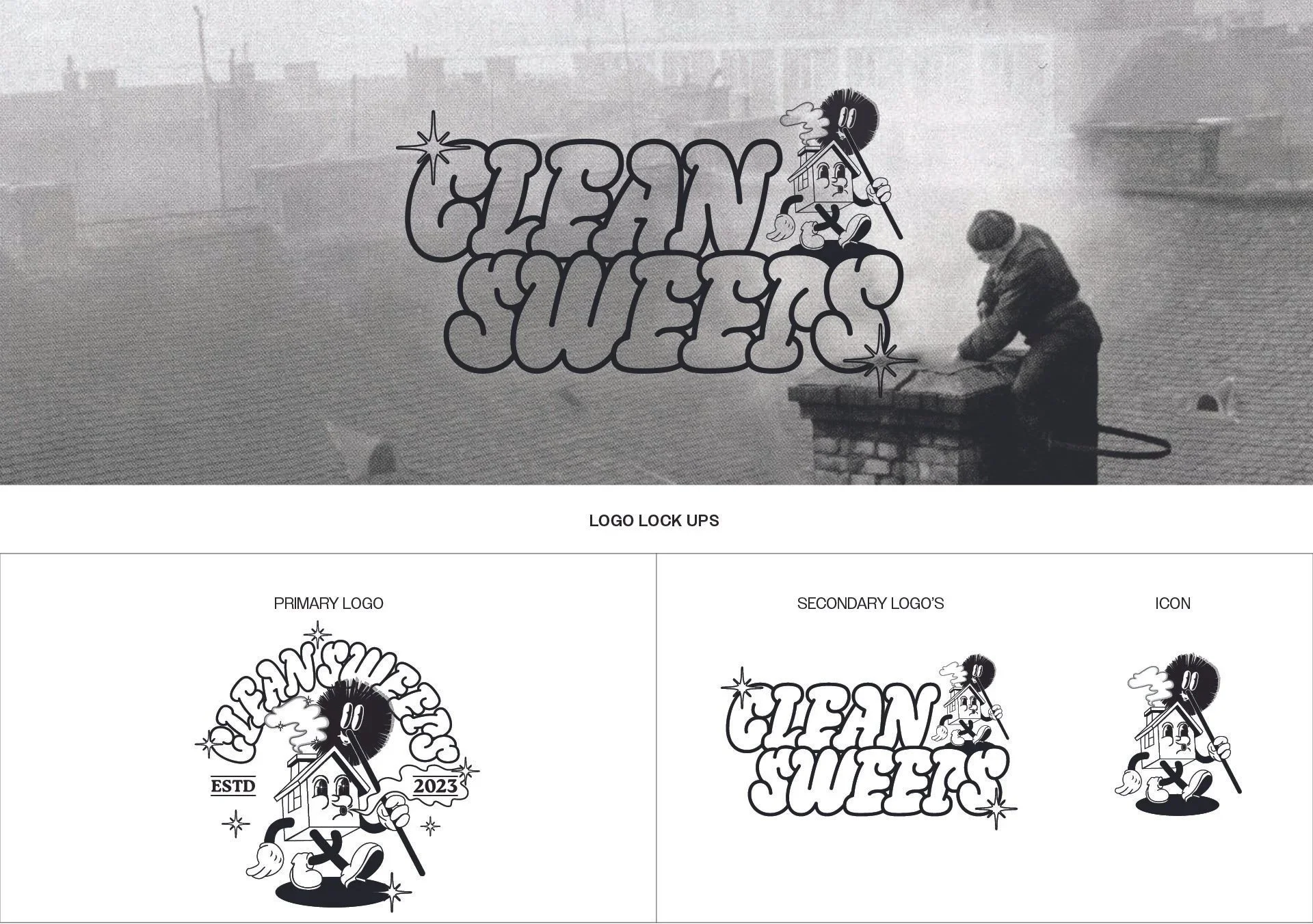
CLEAN SWEEPS
Brand Identity Design
Client: Clean Sweeps
Location: United Kingdom
Industry: Trade
Branding; Bethany Mulchinock
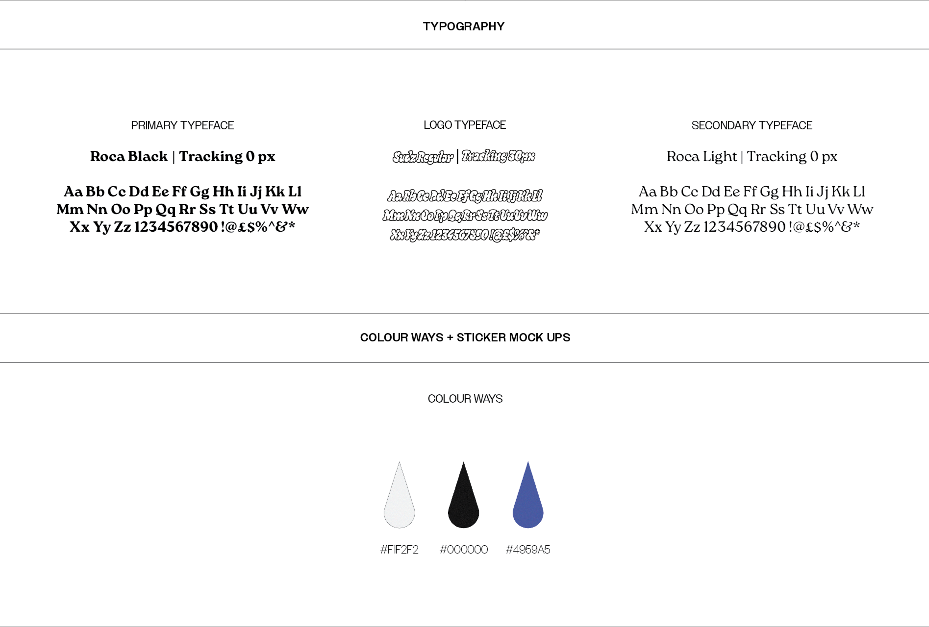
COLOUR WAY
The colour palette is simple, classic, and high contrast; Black — Strength, heritage, and craftsmanship, White — Cleanliness and clarity, Royal Blue — A vibrant accent to modernise and energise the design. This restrained palette allows the illustrations and typography to shine, while maintaining a timeless look.

LOGO - LOCK UP
The logo system was designed with flexibility and storytelling in mind, the primary logo combines a bold retro word mark with a custom illustrated chimney sweep mascot to anchor the brand in its traditional roots. The illustration gives the logo character and warmth, while the retro-inspired lettering ensures a strong and recognisable identity.
LOYALTY CARD MOCK UP
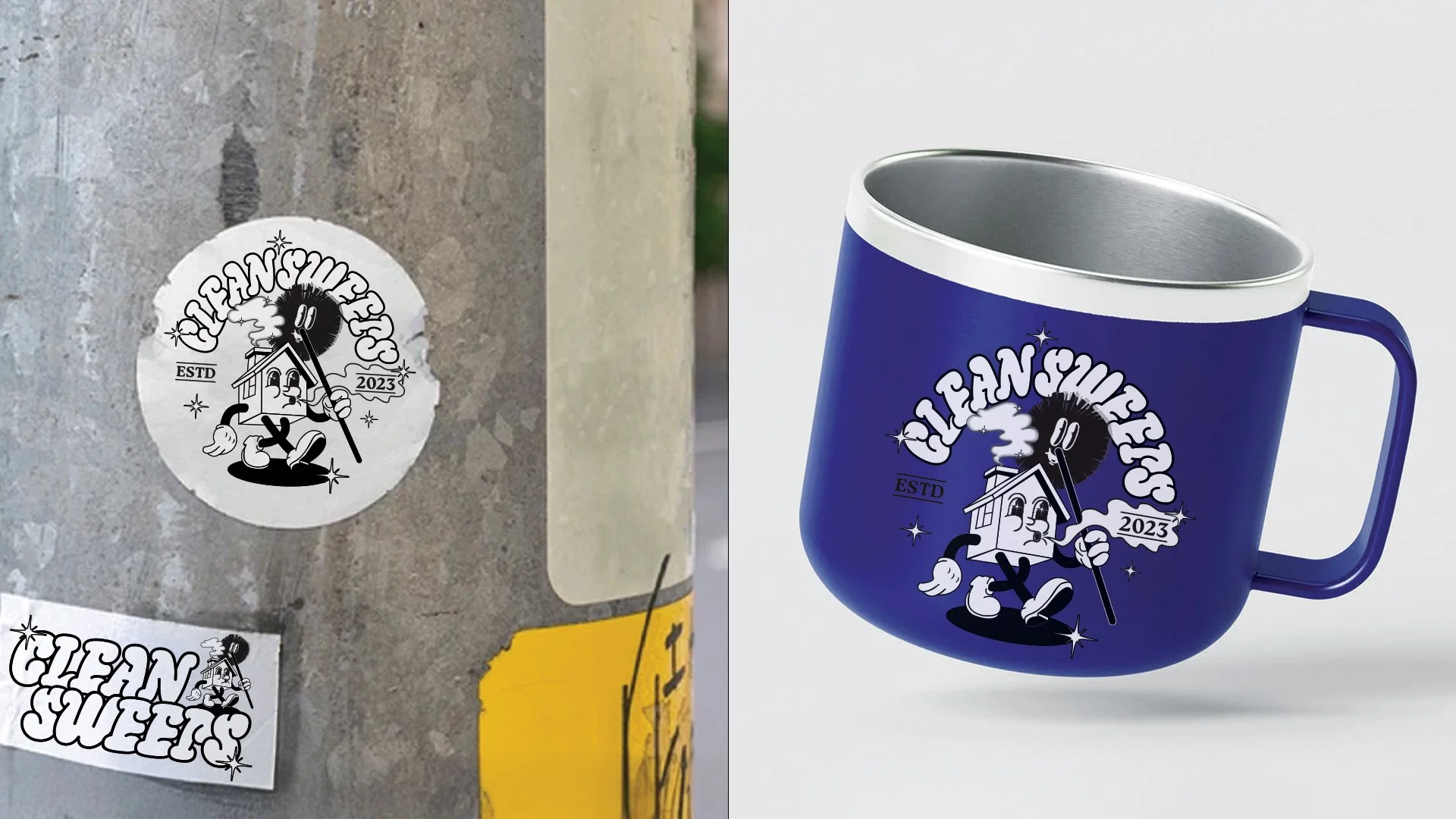
To bring the identity to life, the brand system was applied to real-world touch points, creating a cohesive experience. The loyalty card design is a nod to traditional punch cards, encouraging customer return and creates engagement.
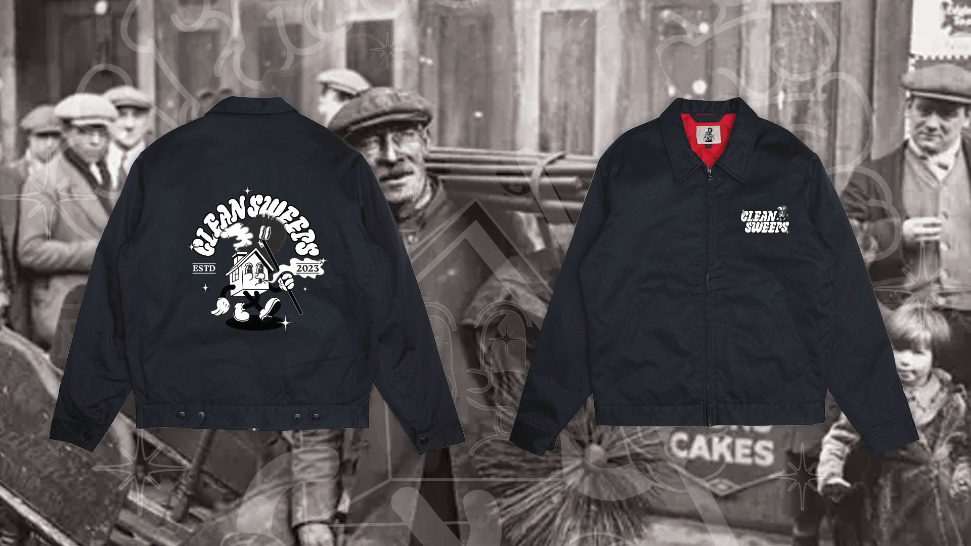
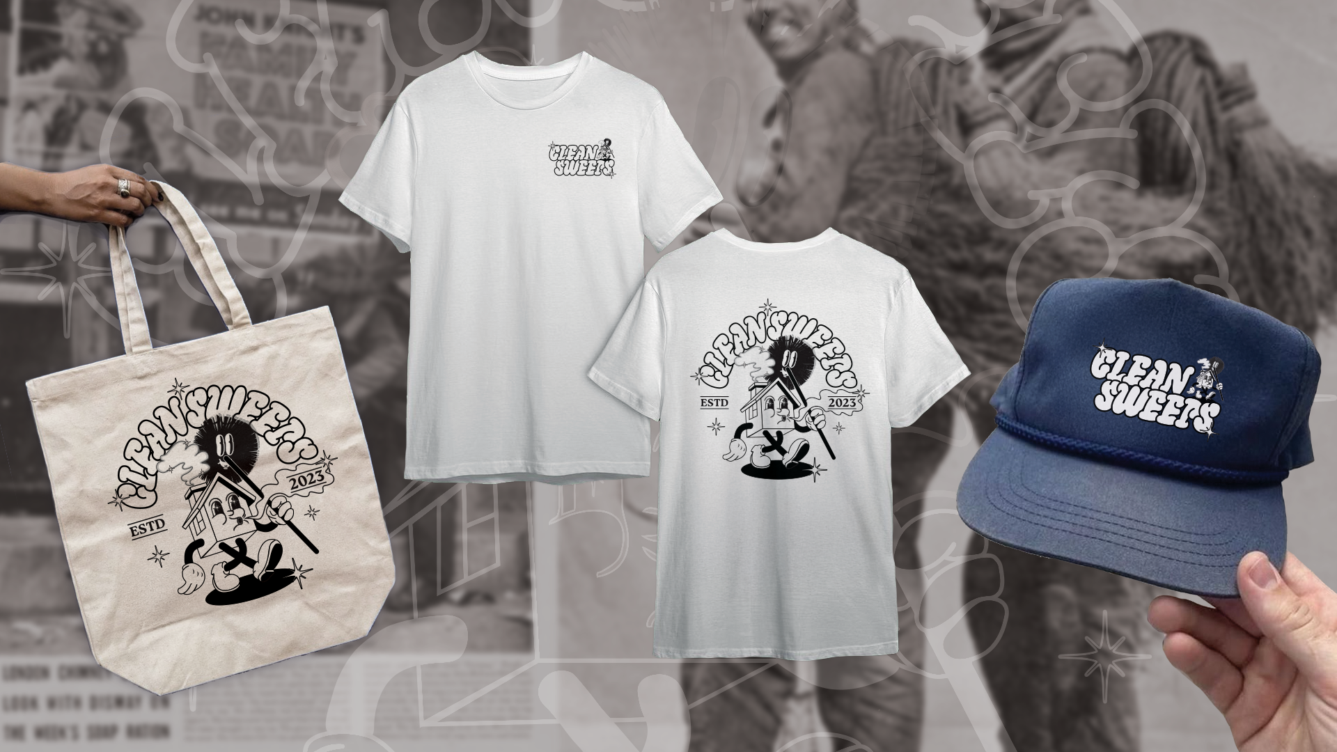
APPAREL MOCKUPS
Apparel plays a key role in the brand’s identity and visibility. Tote Bags and T-Shirts featuring the mascot and logo to build community recognition. Caps and Jackets are designed for both staff uniforms and promotional use, merging functionality with strong brand presence. The apparel maintains a consistent colour palette and clean design, ensuring recognisability in any setting.
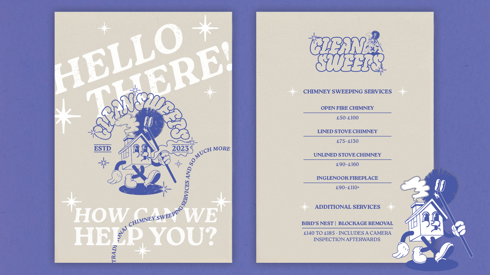
PRICE LIST MOCKUP
The price list mockup has a modern layout with vintage flair make service information clear and approachable. With a hello posture playful copy and illustration to build brand tone of voice. The retro, playful mascot is a nod to the older traditional poster adverts and reinforces trust and credibility while giving the brand a storytelling layer.