BAM (Beauty And More) is a UK-based beauty and skincare brand specialising in high-quality Korean beauty products, sourced directly from Korea and curated for the UK market. The brand aims to introduce UK audiences to the performance, elegance, and innovation of K-beauty, while standing out with a bold, editorial visual presence.
The BAM customer is trend-aware and design-conscious — overlapping with the audiences of brands like Refy, Skims, and popular Korean skincare labels. They value minimalism, aesthetic packaging, and authentic cultural influence.
BAM
Brand Identity Design
Client: BAM (Beauty And More)
Location: United Kingdom
Industry: Beauty & Skincare
Branding; Bethany Mulchinock
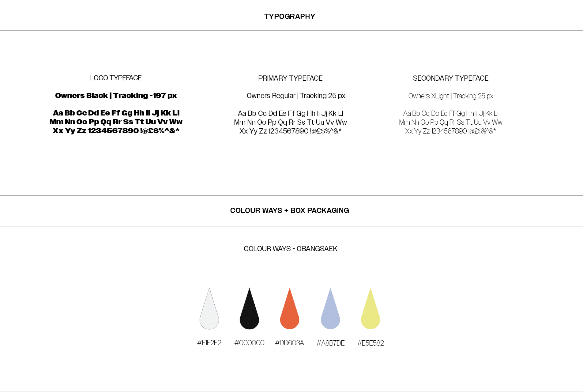
COLOUR WAY – OBANGSAEK
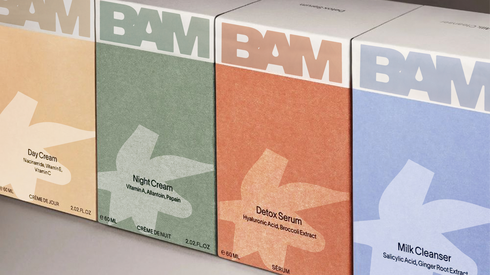
The colour palette is rooted in Obangsaek, a traditional Korean colour theory representing balance and harmony through five primary colours; White – Purity, Black – Strength, Red – Vitality, Blue – Clarity, Yellow – Energy. These colours not only honour Korean heritage but also create a versatile and recognisable system for packaging and product categorisation.
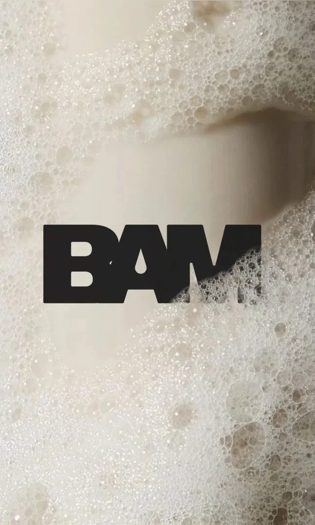
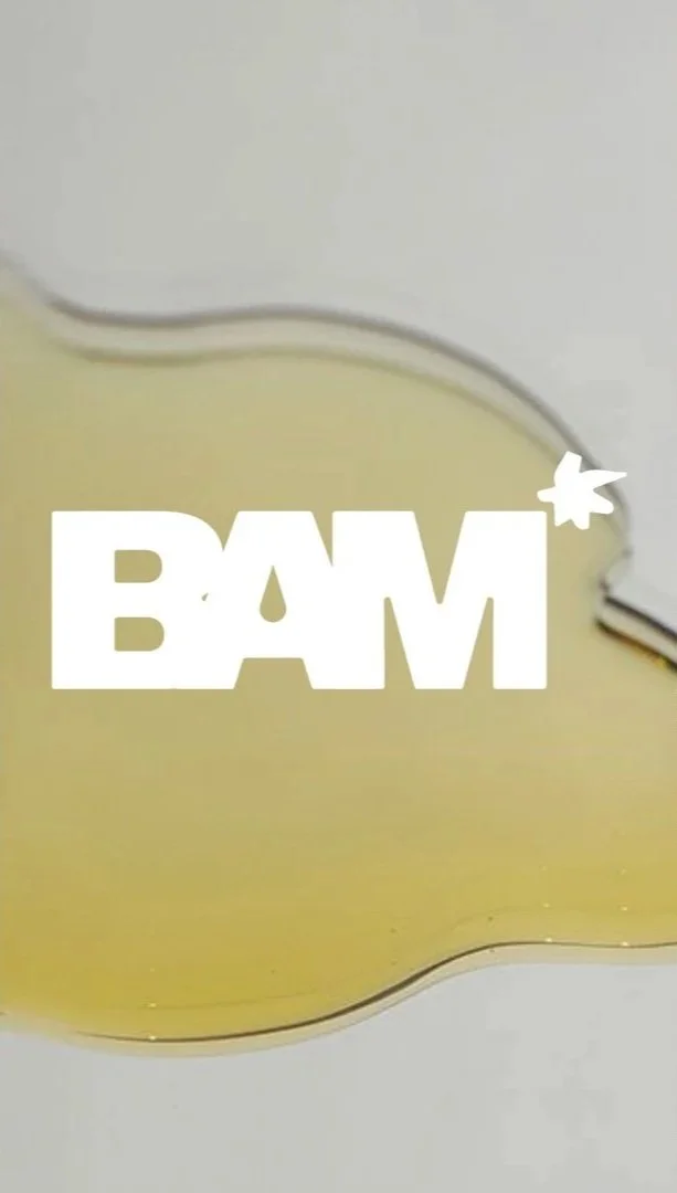


LOGO - LOCK UP
The BAM wordmark is set in a heavy sans-serif typeface (Owners Black) with ultra-tight tracking for a confident, fashion-forward feel. The bold logo is paired with a custom icon that adds energy and uniqueness — an abstract, starburst-like symbol inspired by editorial accents and playful K-beauty motifs along with the symbol of a product swatch.
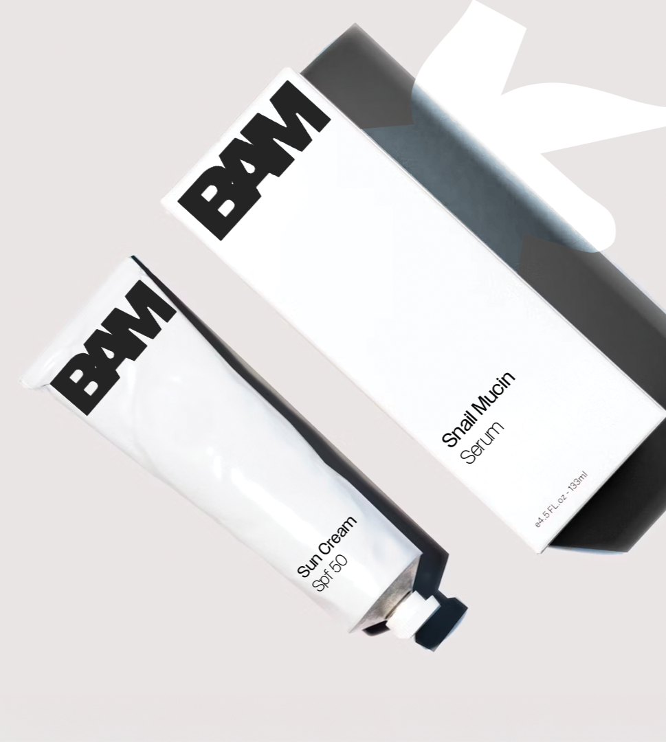
PACKAGING DESIGN
Packaging was developed across multiple formats to reflect the product range — including sachets, tubes, and boxed skincare items. Each format uses bold logos and large-scale iconography for maximum shelf impact. The Obangsaek colour system helps differentiate product lines, reinforcing clarity and visual identity.
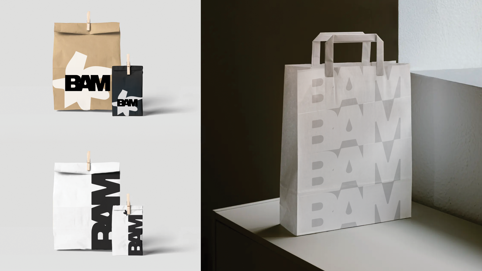
BAG & COLLATERAL MOCKUPS
Branded bags and collateral feature large-scale BAM lettering, clean layouts, and minimal embellishment. A monochrome bag design with a repeating BAM logo creates a high-end, fashion-adjacent feel, ideal for retail and influencer packaging.